Ignite your website
Posted by: Matt SalerBecause I’m the Astronomy Guy at Elexicon, I’m once again going to use my work as an excuse to post about Space.
Here’s a breathtaking photo of the Orion Nebula.

I’ll let Phil Plait of Bad Astronomy (now at Syfy) describe what you’re seeing:
This image of the Orion Nebula is one of the largest and deepest ever taken. It was done using the HAWK-1 infrared camera attached to the Very Large Telescope in Chile, an 8.2 meter telescope that can see celestial objects in extraordinary detail. This image is not exactly what was released by the European Southern Observatory originally; the observations were remastered by astrophotographer Robert Gendler to bring out more detail and to really shine a light (so to speak) on the phenomenal beauty of this immense stellar nursery.
There’s some important science lurking in this image, but there’s something I want to point out first. The glowing part of the nebula is actually just a small part of a much larger complex called the Orion Molecular Cloud. It’s a dense, cold cloud of gas and dust, invisible to the eye, and stars are forming in it. A clutch of stars happened to form near the edge of the cloud, and once they switched on after birth their intense radiation began carving enormous cavities in the gas, chewing away at the material in the cloud.
Because they’re near the edge, they eventually ate a hole on the side of the cloud. In a sense they popped the bubble, blowing out the cloud at their location, which happened to be on the side of the cloud facing us. When we look at the Orion Nebula, we’re actually seeing a dimple or divot scooped out of the denser material. The lower density and much hotter gas filling that dimple glows brilliantly, creating the nebula we see.
This image actually shows that extremely well. Redder material is denser, and the blue glow suffusing the nebula is lower density, hotter gas, tracing the shape of the cavity. It’s an extraordinary glimpse literally inside the nebula.
In other words, you’re looking at a star factory. This video from the Science Channel explains what goes on inside that factory:
The TL;DR version: when gravity clumps enough material together, pressure can build to a point that the atoms of that material fuse together. Those atoms then release their energy in a chain reaction that ignites as a star. A star is a perpetual series of nuclear explosions balanced by the contracting force of gravity—until the fuel runs out.
How star formation relates to content strategy
We sometimes see attempts to trigger website ignition by throwing all available website-y material together in one collection of web pages. Unfortunately in those cases, physics isn’t taking over just because staff bios, a company history, and excerpts from brochures about products or services are gathered together.
Without strategic planning and intentional organization of content, you can end up with a loose mess of material adrift in a nondescript corner of the universe—er, the internet.
Here’s the thing: those clouds of dust in the photo above are the same material that ignited to become stars. The clouds are reflecting light from nearby stars or radiating heat from those stars as light—they’re not giving off their own light.
A website that is similarly just a loose association of website-y stuff is also defined in contrast to other, ignited websites using similar material—competitors. And it won’t look as good as a cloud of space dust backlit by stars.
This applies at the page level, too. For example, efforts to make the homepage ignite can lead to unusable clutter that drives visitors away or leaves them with an unclear path to what they need. You don’t want a page like that standing in contrast to the ignited homepage of a competitor.
The lesson: you won’t get ignition with your website without some intentional arrangement of the material. You want the web equivalent of the atomic fusion that ignites a star.
But also remember: once you have ignition, you won’t have the balanced forces of chain reactions and gravity holding it together. You need a plan in place to keep the fires going.
We can help with that
Elexicon’s content strategy services can help you figure out what you have and what you need, as well as how it all should be arranged to achieve a stable, lasting ignition. Together with our design and development services, we can help you achieve a clear, usable, and human-centered experience for your users.
Your website can shine on its own. And, hopefully, outshine the rest of the stars.
‘Elexicon’ defined
Posted by: Brion Eriksen
As founder of Elexicon, one of the most frequent questions I get is “where did you come up with the name?” Sometimes they follow up with … “It’s cool!” — so these folks just answered their own question: It popped into my head, and I thought it was cool! 🙂
But what made it “just come to me?” Well, it was 1998 (cue flashback visuals and sound effects), and I started a business to follow new opportunities in the web site design and development space. I also wanted to remain focused on my background and ongoing freelance services in technical communication, information architecture, user interface, and marketing communications (all these things converged nicely into web design, of course). All things Internet and dot-com those days had an “e-” attached to their name, so I started the classic scratch-pad exercise: “E-Communication”? “E-Userinterface”? “E-Infoarchitecture”? Nah … but the word “Lexicon:” now we’re getting somewhere. A Lexicon — a unique language and vocabulary — brings meaning, understanding, and purpose to a branch of knowledge, a culture, a sport, a brand. In our new business, we’d master the “E-lexicon:” the lexicon of interactive communication and digital interfaces. Perfect! It’s all one word, capital E, no hyphen: Elexicon.
Even in those early days, domain names for businesses were getting snatched up left and right, so my hands were shaking when I secured elexicon on Network Solutions. As a purist, I take not a small amount of pride in having “elexicon.com,” not “ElexiconTeam.com” or “ElexiconUSA.com.”
So next time we see each other (hopefully soon!), you’ll have that answer and we can get to whatever other questions you may have!
I miss my home (button)
Posted by: Brion Eriksen
I love all of Apple’s bold design decisions … except this one.
I have now been using my iPhone X for the better part of two months. Owning and using previous versions of the amazing device since 2007 has gradually and reliably increased my productivity and added new elements of delight with each release. But by removing the iconic “home” button from this latest iteration of the device, I feel like some friction has been added to this otherwise smooth path of progress.
Why?
So, why did Apple remove the home button? In some ways, I feel like I should just understand why they did it by using the new phone without it (but I haven’t). At the same time, as a UX designer I’ve done my share of reading news and reviews and consuming podcasts to get the general gist of what they were thinking.
- First, there’s that over-arching strategy of moving to an ecosystem of devices without wires or physical buttons, just as digital music phased out vinyl and magnetic tape. This is a segment of a “frictionless” future with less touching and tethering that includes everything from voice-driven smart speakers to checkout-less grocery stores.
- Dovetailed with that, there’s the parallel strategy to (already) replace the biometric security of your fingerprint using TouchID (so soon?) with what is stated to be an even higher level of scrutiny: Unlocking the phone with your face.
- Running evenly alongside the no-physical-buttons strategy is the move to a top-to-bottom, bezel-to-bezel screen. (Look! The whole phone is a screen!) This feels like an innovation for the sake of an innovation, like Apple had explored every possible other corner of the that’s-cool universe (and every inch of the iPhone’s structure), and decided that they had nowhere to go but to offer a full-screen front.
But, was one of those reasons “It’s more user-friendly”? No … I’m not sure I’ve heard or read about usability being a big part of the strategy. Because the new device, inarguably, is less usable.
Living without a home button
Fans of the iPhone X may jump into the comments section and counter-argue, but here are some examples of my plight.
Swiping is harder than pressing. An upward thumb-swipe from the bottom of the device has to be about 10x more physically taxing than pressing a button … it reminds me of the saying that it takes 10 times more facial muscles to frown than to smile. I don’t know if either is actually true … but why am I even talking about a new Apple product being more “physically taxing,” even if I’m sounding silly and wimpy about the muscles in my lower hand?
This beauty needs a case. The previous issue segues into this next one: At a $1000 price point and a structure made of glass on both sides, using a case is a requirement. So a hearty enough case makes the thumb-swipe even more of a chore … my thumb needs to bump and trip over the bottom of the case, land on the white horizontal virtual-swipe-here strip, and keep skidding upward to complete the swipe.
Also, with a protective case, the bezel-to-bezelness of the screen seems less so, and the “speed bump” of the case edge happens on all sides. (Granted, of course, there are “thin” case models that do not present such a challenging edge, but I like the more robust protectiveness of my Tech21 case.)
(As a side note, I should also mention the counterintuitive absurdity of the iPhone: The more beautiful and sleek the product design, the more you feel the need to protect its shimmery fragility. More than any version before it, the X model is even more slippery and eminently droppable and crack-able. So, the X is a lovely thing, but into the hefty protective case it goes.)
FaceID is harder than TouchID. I’m a big fan of TouchID. It’s easier than typing in a passcode to unlock the lock screen, and now FaceID takes that level of ease backward. FaceID is not only harder than TouchID, it’s harder than the Passcode. FaceID requires 1.) lifting the phone in front of your face, then 2.) the upward swipe. TouchID allowed you to open your phone with a finger-touch of the home button, while bringing the phone into your line of sight, not after you’ve brought it near your face.
Relying on your face to unlock the phone eliminates the ability to quickly check or use the phone while it’s sitting off to the side on a desk, or when simply pulling it briefly out of your pocket but keeping it at your side. (Another cynical “guess” at the strategy here: Apple wants to sell you an entirely separate Apple Watch for these kinds of interactions.)
By “harder,” I mean “often ridiculous.” FaceID-plus-swiping has written a few tragic chapters into the history of Apple UI’s. Have you run into this monstrosity yet? If you have your settings set to require FaceID to authorize an app download or iTunes purchase, you first need to trigger the process by clicking the side/power button:
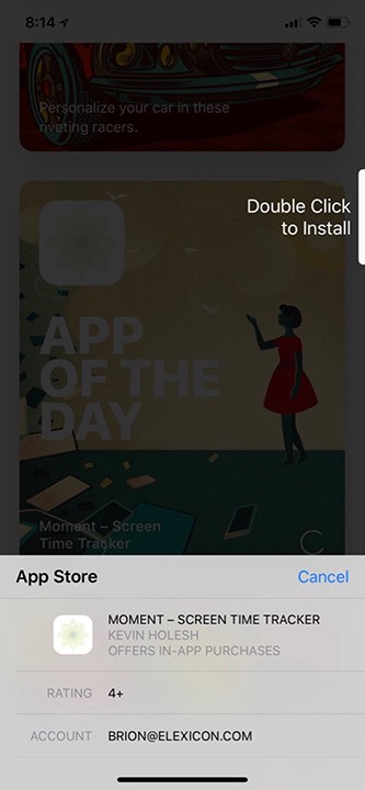
Raise your hand if you tapped on “Double Click” several times before you realized “they mean the side button.”
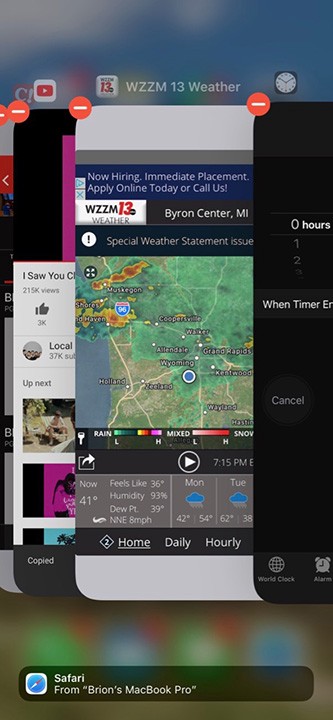
Also, the home-buttonless technique for closing out your open apps has now become a devil-dance for your thumb’s fine-motor control. Once you get the hang of it, it’s not a big deal … But there I found myself saying out loud what had rarely been part of an Apple maven’s vocabulary: “This used to be easier.”
What about the trade-offs?
Are the above annoyances offset by the bezel-to-bezel screen, and FaceID’s increase security and other “fun” features?
The pretty much, almost edge-to-edge display. Notice I didn’t call the screen “edge to edge” or an “endless” screen like one of those luxuriously mystifying endless pools you see in fancy resort-spa commercials. There’s still a bezel, it’s just pushed outward at the top and bottom. But the now- notoriously iconic “notch” is basically a de facto bezel at the top. The wonderment of having “screen” space in the upper left and right of the phone interface is lost on me.
This feature simply doesn’t score many points in the “pros” column, and in fact only puts a couple check marks under “cons.” With the screen now filling out to the rounded edges, the interface conjures a feeling of going backward to CRT screens, before LCD’s brought us a truly rectangular 16:9 like we saw at the movie theater, complete with corners and everything. Nobody ever decided to round the corners of a cineplex screen, a plasma TV, or a MacBook Pro display.
I’ll take my top and bottom bezels back, please. An “endless” edge-to-edge experience from side-to-side would be nice — similar to what Samsung has been doing for a few years.
Fun with FaceID. As mentioned before, FaceID is a more secure means of biometric authentication than TouchID — 20x more secure according to commonly stated claims. This sounds good!
However, being a FaceID cynic, I had to ask: Was hacking of TouchID rampant? The answer seems to be “not really,” although Apple does appear to have some work to do to make TouchID even more secure. This article summarizes how TouchID can be hacked, but also acknowledges how difficult it is. (Think: Convincing your victim to make you a mold of their fingerprint in Elmer’s glue.)
Now that FaceID is developed, my preference would be to bring back the home button and keep FaceID as an option, as well. Enterprise I.T. departments may enjoy setting up high-risk devices to require both fingerprint and facial authentication. Now that FaceID is here, I’m not suggesting that it needs to go away … I just feel like this first attempt at integrating facial recognition into the phone-unlock process has been a dud.
Giving your face away
I’ve never been a militant I.T. security fundamentalist, but the latest round of no-touch/no-wires technology has given me some pause. I wasn’t crazy about giving Apple a “true-depth” scan of my face, and I haven’t jumped on the smart speaker bandwagon. I’m ignoring the latest iOS’ incessant pleas to “finish my installation” by importing my credit cards into Apple Pay. I’m beginning to feel like I can live on this plateau of technological innovation for a while. Heck, I’m still using iTunes, still paying $1.29 so I can own every song. Like driverless cars, FaceID seems like an innovation that is out-running practicality.
The way forward
Facing another 10–11 months with the iPhone X — before I’m eligible for Verizon’s trade-in/upgrade program—I’ve attempted to add the “virtual” home button. Here are instructions on how to do this … but I don’t recommend it. This feature is a hold-over for iPhones whose home button was damaged, and doesn’t play nice with FaceID and the swipe bar at all … it’s kind of a mess.
This stop-gap virtual button does conjure visions of a more useful under-screen-based home button that actually works. Perhaps positioned in the bottom “tray” between your most-used apps and including TouchID, it could be the perfect solution to my ills. Some “insider” reporting is trending toward predictions that the home button will soon be a goner, retired to the User Interface Hall of Fame, enshrined next to the iPod Click Wheel. Elsewhere in the rumor mill, Apple is reported to simply be rapid-prototyping authentication interfaces in real time.
If Apple truly is keeping an eye on user feedback and opinion, as this Forbes article suggests, then let this review be my testimony. As long as there is an iPhone model available that still features a home button and TouchID, that’s the one I’ll buy. I hope those models remain available for a long time.
Making things clear in a world of constant disruption.
Posted by: Mike Verstrat
Let me be clear. Things aren’t clear.
I crave clarity. I think most people do to a certain extent, but seriously — I’m in a stretch of going bonkers with all things unclear:
- Parking meters that don’t specify active days and times.
- Quick service restaurant digital signage menus that hide many of the prices and items in favor of slow-mo footage of bubbling soda and extreme food closeups. (I know, just another reason NOT to do fast food.)
- The online user experience I had to endure last week for one of my financial accounts.
- covfefe.
- Construction barrels that reside along roadways for weeks on end without any apparent road work to support.
- Medical billing statements. Actually, pretty much anything having to do with the word “medical”.
- A no smoking sign above an ash tray. I don’t smoke, so maybe this is clear? Seems like a mixed message to me.
- This example which is really, really TL;DR … so to speed things up, let’s just say “Automated Parking Lot Machines”.
I can assure you the above is a very partial list, and for most of these, I have no control or remedy. But when it comes to communicating clearly in written, verbal, and visual communications for clients, I’m fortunate to be able to put my angst to work and strive to make things clear.
What is clear?
It’s pretty clear what “clear” means, right? It’s a powerful word attached to everything from what you hope for in the skies as you lift off the runway to the kind of water you prefer to swim in, to what kind of definition you expect to find in a dictionary. Which by the way defines clear as:
“Easy to perceive, understand, or interpret.”
That definition is clear, but it’s also important to note the connection between clear and accurate. It should go without saying that something clear, but wrong … isn’t of much positive value. So getting things right goes hand-in-hand with getting things clear. If we are passionately clear about something, but rest on our laurels when it comes to accuracy, we get ships that are clearly unsinkable and an earth that is clearly flat.

Taking this a bit further with that latter example in mind, the root problem of the (mostly pre-Aristotle) flat-earth presumption isn’t just the idea itself. Wrong ideas and bad information enter our consciousness all the time for a variety of reasons. However, the flat-earth fear that fooled many people for centuries had at its core an inability or refusal to continue to pursue, perceive, and interpret the presumption on increasingly deeper levels — to have a zeal for clarity and certainty regarding how viable the flat understanding was.
But there were some who had the zeal. There were some clarity curmudgeons like Aristotle who kept going … kept questioning … kept revisiting what people thought they knew … and that made all the difference in the world. Because when you crave clarity, you’ll make the extra effort to tack into the headwinds of assumption and wind up with the lovely discovery that you aren’t doomed to fall off the ocean’s edge after all. You just keep sailing on to new truths and new assumptions to challenge.
So it’s worth diving a little further into this idea of making things clear, and maybe teasing out what might be going on when we do and don’t.
Why aren’t things clear, and why should I care?
I think there are many forces working against communicating clearly, but a partial list might be:
1) General apathy toward the effort. The constant barrage of words and images in our lives means even creative communicators have become overworked and over-busied, and therefore complacent in response to things unclear. In short, when things are unclear, a fallback position of “ignore it and move on” might be in play.
2) Our clear isn’t someone else’s clear. Many factors affect clear communication including life experiences, cultural nuances, and the amount of passion someone has to work toward clarity in either receiving or sending communication signals.
3) Stockholm syndrome. This might be a stretch, but it’s possible that vagueness or a lack of clarity has held us captive for so long it starts to become an accepted state of being or even a welcomed source of comic relief. I think in some strange way, we’ve started to expect or even enjoy having things unclear encircle us. With everything everywhere seeming unclear and out-of-whack, we’ve pre-loaded our brains with cathartic rants like “Oy. Another contradictory study about the effects of coffee.” Or “Why do I even bother to check the weather?”. We grumble, vent and chuckle about things unclear all the time — and the endorphin trickle that results keeps us numb enough to carry on. But I think it’s good to keep in mind that at the true center of any unclear touch point— whether we’re laughing at it or not—lies a real struggle; a wall of frustration too primal for cynicism to eradicate. I think we really want to have and make things … clear.
“The world is fuzzy sometimes, I get it,” you say.
“What’s the big deal? Why obsess over making things clear?” you ask?
Well, the world isn’t just fuzzy. It’s being disrupted constantly and with greater speed as time marches on. Political upheaval, shifting financial markets, rapid advances in technology and science, competing agendas among groups and businesses … all continue to trend upward in frequency and magnitude thanks in part to advances in communication infrastructures that speed up the deployment of data and disruptions. So “the big deal” of things unclear is made manifest by the reality that confusion today can compound exponentially tomorrow.
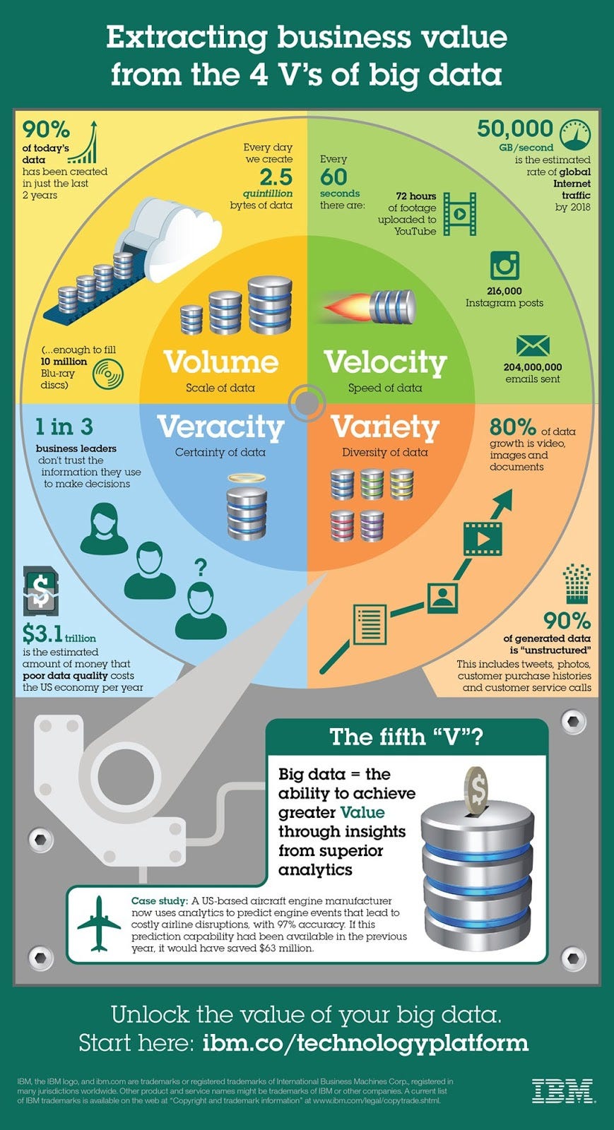
When important communication efforts are unclear (or unclear by their absence), confusion happens and re-happens rapidly. Confusion costs us time; time is money; and money lost to confusion isn’t well spent. It’s not all that complicated a formula really, and it can seem inconsequential at first glance. Yet when you add it all up and really examine the details of the many unclear and/or inaccurate situations that trip us up in our daily routines, I think it’s pretty astounding how costly unclear can be. Just a quick glance at the problem of bad data can give a good sense of this. 3.1 trillion smackaroos is a pretty big consequence for things being wonky.

So maybe you have an important positive disruption to put in place, somewhere in the already disrupted world. Great. Breaking ground with a valuable new idea, product, or service is still what moving forward as a global community is all about. But know this, if your disruption isn’t surrounded with clear (and yes, accurate) communication the truth is that your disruption will probably be disrupted pretty quickly by confusion, apathy, or both on the part of your intended audience or customers. Your ship will be dragging anchors as soon as it sets sail.
How to make things clear (in a seriously compressed nutshell).
Despite the word “easy” being found in the definition of “clear,” making things clear when communicating can be anything but. For starters, there are the forces aligned against the efforts of clear communication (as touched on above). These forces show up throughout a project and threaten its success, so staying vigilant and alert against them is the starting stance for any effort to clearly communicate.
Additionally, in my experience, when we sit down with clients to begin to craft strategies there are often several points of tension between the known and the unknown, the clear and the unclear in what the desired goals and outcomes are for the effort at hand. Typically progress in communicating clearly is hindered right at the outset when clients have certain points they want to make but aren’t sure how to make those clear, or they haven’t answered the “Why?” question clearly as to what needs to be accomplished. You usually hear some of these words — antonyms of clear—in conversations as these points of tension arise:
uncertain, unsure, unsettled, up in the air, debatable, open to question, in doubt; doubtful, ambiguous, equivocal, indefinite, vague, mysterious, obscure, hazy, foggy, nebulous, informal, iffy
Those words usually involve variables and challenges the client is facing and tag the conceptual drag forces on the progress of communicating well. So how do we combat those forces? Specific tactics for that are nuanced and varied, but much of the battle to make things clear is found right there at the outset — in pure and simple observation and inquisitiveness.
Battling the drag forces of clear communication — whether it’s affecting a press release, web site, ad, info-graphic, SEO effort, UI design or a UX study — all begins with a commitment to see an unclear or potentially unclear thing for what it is, name it, and decide not to accept it without a fight. It’s not always possible to do this as a consumer, but when you’re in a maker role, you get to put your big person pants on and just say “No.” to unclear. You get to stare unclear beasts in the eyes, probe, ask hard questions of subject matter experts, isolate, immobilize and target the gremlins of unclear and thereby help bring order to chaos.
It’s also worth noting that things are not always clarified quickly. Sometimes months of effort and customized approaches are needed. But regardless of the time it takes, it’s incredibly fulfilling and extraordinarily important to make things clear — and you’ll likely find other clarity curmudgeons (I know of a few) who are ready to join in the fight.
“Take your time. Accuracy is a virtue.” — Boba Fett, The Mandalorian Armor
So after seeing and targeting the unclear beasts … then what happens? Well, lots of things. But where to begin? As the composer John Cage has famously said, “Not knowing where to begin is a common form of paralysis.” His advice: “Begin anywhere.”
But if you’re really stuck, a few potential make things clear kickoff action items might be:
- Contain the complicated. Complexity and an abundance of detail will always be with us, but look for ways to put the simple communication up front, with drill-down information suppressed, but still available to your audience if they choose to seek those details out.
- Ask yourself (in reference to a thing’s aesthetic) “What does this ‘say’ to the audience at first glance?” Record all the descriptive words that first come to mind as answers (good or bad). Ask others the same question and record those answers. Is what you’re trying to visually communicate quickly coming through? This is a simple technique to arm yourself with anecdotal, but valuable data in your quest to be clear in what you’re making.
- Simplify simplify simplify. Do this with an image, type choice or messaging and content. This might kick off with accepting migrating visual trends, moving from the skeuomorphic to the flat. It might progress to paring down word count, or investing heavily in the content editing phase of a project before anything else takes place. You rarely want to go too far with simplification efforts that you land at under-informing (unless mystery is part of the desired result), but you do want to always make sure what you have in place is clear.
So without further ado, look around you. What you see is the unclear world as it sits right now. Go make it clear.
User interface vs. face-to-face
Posted by: Brion Eriksen
Do you prefer Mr. Roboto for your customer service? I’m not completely sold.
In their 1983 single “Mr. Roboto,” the Chicago rock band Styx envisioned a campy dystopian future where robots substitute for manual labor and, incidentally, rock and roll is outlawed.
Well, 35 years later that once-critically-panned/now-guilty-pleasure hit seems to have been half-correct. “Robots” in the form of algorithm-driven streaming services are helping keep popular music alive, but automation is indeed also continuing to supplement, augment, and replace people and jobs.
In the three decades since that time, electronic and digital interfaces have been enabling unprecedented efficiency and convenience in customer service and manufacturing. For consumer transactions in particular, we’ve seen ATMs supplement bank tellers, kiosks augment airline agents and grocery clerks, and pay-at-the-pump systems completely replace gas station attendants.
E-commerce transactions have also, of course, allowed us to evade human contact with phone representatives, brick-and-mortar stores, and travel agents. Lately, some of these transactions have migrated to smartphones, where you can hail an Uber or unlock a Zipcar. Apple’s Siri and Amazon’s Alexa have also arrived as mostly in-the-home technologies for now, but along with chatbots they’ll widen the “net” further of things (through the “Internet of Things”) driven by artificial intelligence.
Up next: Restaurants
You may have noticed this trend at restaurants. Table-side digital kiosks are popping up at Olive Gardens and Applebees, and you can place your order on an iPad at the gate-side “Minnibar” at the Minneapolis-St. Paul airport. These tools mainly assist the waitstaff and bartender with drink re-orders and payment processing. The human staff is still involved in placing your initial order, bringing your food and checking in on your satisfaction.

Arriving recently on the fast-casual restaurant scene is Eatsa, featuring virtually no waitstaff or counter help. Their (delicious-looking) quinoa bowls are prepared behind-the-scenes (by humans, we assume) based on your order from a digital screen, and delivered to you through a Star-Trekky portal window.

Politics intersects
President Trump’s original choice for Secretary of Labor raised eyebrows, partially because of his frank talk about work automation. Andy Puzder happens to be the CEO of CKE Restaurants, the holding company for Hardee’s and Carl’s Jr. In the past two years before his nomination, Puzder has written opinion pieces for the Wall Street Journal making some interesting commentary and arguments about digital UI’s, AI and robots, and intersected them with wage costs and customer demand.
You should be able to read the piece as free content as a non-subscriber to WSJ; however you may require a subscription.
Fortune.com has a similar article on the topic that features Puzder and reflects many of his same thoughts.
Puzder’s nomination was eventually withdrawn due mostly to various other personal issues, but many members of Congress also questioned why an executive who touts replacing workers with robots—and, in conjunction with this thinking, questions raising the minimum wage—would be the right choice for Labor, and I agree. For the purpose of this essay, however, I think Puzder makes some interesting observations about consumer preferences, and speaks bluntly about doing the economic math.
Before I succumb further to the strong gravitational pull of the politics surrounding Mr. Puzder and the new Cabinet, I’ll remain focused on the picture he paints of customers preferring to transact with a kiosk instead of a human—and what that means.
I’m (usually) a people person
I usually prefer to interact with a human. I’m not one of those folks who Puzder describes in his article who line up at the digital screens while a lone remaining counter attendant waits, disengaged. If I encounter that scene, I’m making a beeline for the personal service. I scour the attended grocery check-out lanes for short lines before bailing out to my longtime pet peeve, the self-scanners.
My boys would often laugh at how frustrated I’d get when using the self-scan lane at the supermarket. Something would inevitably go wrong between the scanner and scale, the “help” light would begin blinking, the mechanical voice would call loud attention to my plight, and a helpful young steward would come over, swipe their employee card, and flush out the error. I’d suppress the urge to ask the innocent youngster “why do they even have these? They still need to pay you to constantly monitor them anyway!?”
I’ve noticed significant improvement in self-scan function recently, and my angst has subsided. Check-out attendants are still there to monitor security and provide help, which seems more complementary. It’s good to know that someone is there, but I no longer have this customer experience where I’m doing most of the work while someone is being paid to be on standby, ready to jump in and help just in case.
The same goes for kiosks in restaurants and bars. I’ve visited an Olive Garden and the aforementioned Minnibar, and found that the waitstaff and bartender needed to remain well-connected to the whole process even though I had to also fiddle with the iPad. They saved some time when I was ready to pay and leave, circumventing that moment where your companion polishes off her cocktail and says “are we ready to go?” and you reply “still waiting for the check,” or “just need to get my card back.” So that was nice. And at the airport I felt like the bartender would rather I just ignore the iPad, implying “it will be easier and better for both of us.” Overall the joint digital-human customer service partnerships didn’t seem to be gelling quite yet.
Putting customers first
Looking at Puzder’s comments and reflecting on my experiences, I can recognize that technology-driven customer service is continuing to find its footing while it continuously evolves. Electronic and digital transaction interfaces take steps and leaps forward, and then when a brand-new paradigm is injected into the ecosystem, things seem to take a small step back. Everything is hurtling forward at breakneck speed and sometimes customer service takes a back seat to the bottom line (and people’s jobs sometimes get caught in the crossfire).
Personally, I like the idea of taking a bit more care to ensure that we’re always putting customers first before sacrificing user experience for profit margins through the narrow mechanism of reducing purely for the sake of labor costs, which is always a faulty equation. Profits are of course, in the most basic terms, the difference between your revenues and expenses. But value is also a component of profits. We should always think about how digital interfaces and other advancements like artificial intelligence and virtual reality enhance the value a customer places on the experience. What not only brings customers in the door, but keeps them coming back?
- Are customers in a hurry? If they have no use or need for human interaction, an all-digital, self-serve approach will be preferable and we’ll see more on-the-go “giant vending machines” like Eatsa, for example, for a quick-grab before or during the work day. Carl’s Jr.’s CEO seems to have his eye on this approach as well.
- Do customers want to be attended to? This is where kiosks in sit-down restaurants can get a little awkward. Does the digital screen sacrifice a desired personal touch for fewer waitstaff and a bit more order accuracy? As this approach matures, kiosks, tablets and waiters should continue to have a more seamless role in providing service where everyone’s working together.
- In the most posh, upper-scale restaurants, replacing a knowledgeable and highly attentive waiter with a digital kiosk would be out of place, but any restaurant—from fast food to fine dining—could benefit from a more streamlined digital payment system. Think checking out at the Apple Store, where there are no registers to speak of. I don’t know what they do if you want to pay in cash.
- Starbucks customers leverage their app and a “membership” to easily order-ahead so that they can just walk into the store, grab their drink and go with minimal waiting-around friction. Could some food services go all the way with the “Just Walk Out” technology of Amazon Go? Probably! Eatsa could go that route pretty easily, it seems.
Digital technologies are amazing and have improved the quality of life in myriad ways, from safety to efficiency to pure fun and enjoyment. The possibilities are endless and new transaction models are coming online all the time. So, without a doubt there is a place in just about every industry for exciting enhancements. But we should always ask the two-part question:
- First, are we replacing too much human interaction with the customer?
- And are we replacing human interaction purely to save labor costs?
The optimal experience
As the owner of a digital agency, one would think that I’d be excited about all the opportunities out there for our skill sets to design interfaces. Of course — if that’s the best user experience. I am more concerned about the overall experience, not just what happens on a screen. If a customer will receive the maximum value from your product by whizzing through an all-screen/zero-human user flow, I’m thrilled to design that. But first we need to begin by looking at the entire transaction process holistically. It’s imperative that business leverage technology as best they can, but companies and brands should examine specifically how technology, their people, and their customers can work together.
The aforementioned Starbucks and Apple Store experiences are good examples. Technology helps streamline the transaction process but you still have access to a human being to get your specialty latte just right or show you how to switch your iPhone 7 from defaulting to taking photos in Live mode.
In those restaurants with table-top kiosks, those could be used in conjunction with a tablet that the waiter carries, helping ensure order accuracy but also helping with order customization. Waiters could wait on more tables and maintain a higher level of attentiveness when the tablet augments the process of notifying when food is ready to be served, drink refills and re-ordering, up-selling, and handling most of the payment transaction process.
A restaurant that runs at optimal efficiency prevents many of the factors that lead to bad customer experiences: Incorrect orders, and long wait times to get a table and then to get served and cashed out. Instead, tables turn over faster, an extra drink or two is ordered, perhaps even that elusive dessert up-sell. Customers may be willing to absorb slightly higher pricing at such an establishment, and gratuities may not take a hit despite the service being assisted by the kiosk. Finally, all of this may allow for some trimming of labor costs but fall well short of a staffing overhaul.
One of many examples
The Puzder nomination and Eatsa stories have me more fixated on restaurants, but there are many more examples of fascinating intersections between customer service and ever-burgeoning technologies. Everyone talks about what will be the next AirBnB or Uber, and soon “the next Eatsa” may be invoked.
One of my favorite follows on Medium, Tim O’Reilly (of O’Reilly publishing fame) has a great post as part of his “WTF: What’s The Future?” series: “Don’t Replace People. Augment Them.” I think that’s where I’m going with my thoughts above on my Utopian restaurant (hey … how does “Café Utopia” sound?)
I still value human interaction, and I like O’Reilly’s idea on having the imagination to think beyond “what jobs can we replace with machines?” I’ll trade a little extra time for getting personal attention, even if I barely have the time. But I like that I’m getting the personal touch at my favorite stops these days alongside some slick digital tools—far fewer pens that don’t work, trying to sign curled-up paper receipts; and not so many paper rewards punch cards that get forgotten then need to be “combined.”
Now if only everyone could get on the same page when it comes to using that chip card slot or not. Seeing the makeshift “NO CHIP!” cardboard stuffed into the slot sets all this cool tech stuff back a few years doesn’t it? Maybe that will be a topic for a follow-up post.
Or, driverless vehicles 😉
