Starting with “Why”: We Make Things Clear
Tags: Digital Marketing, Information Architecture, UI Design, Usablity, UX![]()
A few years ago I decided that Elexicon needed to re-focus as an agency. I felt like we were drifting a bit, and lacking direction … and that started at the top, with me. Without going into much “inside baseball,” we spent some valuable time that summer of 2014 in weekly meetings where we discussed a range of different topics: Our history, my vision for starting the business, pinpointing what we’re really good at, and identifying what we might not be as good at. We looked at some of the classic wisdom and models for increasing effectiveness and productivity, such as Stephen Covey’s Seven Habits and the Eisenhower Matrix, along with devising some thought exercises of our own.
Another source of inspiration for our meetings was Simon Sinek’s book Start With Why, and his highly popular TED Talk of the same title. The book’s subtitle is “How Great Leaders Inspire Everyone to Take Action” and its premise is that leaders inspire by discovering and defining the “Why” of their team or organization’s work. Sinek wants us to focus on Why we do the work that we do, and make that the foundation of How we do our work and What we ultimately produce. Since the TED Talk was made way back in 2009, I’m sure many of you reading this have probably seen or heard of the “Start With Why” model and watched the talk. If not, I recommend this 20 minutes of viewing…
https://youtu.be/sioZd3AxmnE
Now that everyone has at least seen the video, I will say that Start With Why isn’t a panacea or magic bullet. The “Golden Circle” does not apply to everyone and everything, but I do think it’s a valuable concept to consider and a worthy exercise to go through in most cases, as we do in many of our client strategy sessions.
So, I started to relate the Golden Circle concept to our work at Elexicon. From the start, it was very useful in helping me not only think about the “Why” I started the business in 1999, but also Why our team and I were passionate about our work 15 years later. The next question: Was the “Why” the same as it was in the beginning? For the most part, I thought so … which was reassuring: The firm I envisioned had become a reality — with the caveat that at that particular point in our history we were wavering from that original vision.
The D.N.A. of “Why”
Entrepreneurs start their business for a variety of different reasons, but their motivations usually involve: a.) Doing something they’re good at and passionate about; or b.) A great new idea for a product or service that they feel has a chance to get first-to-market. More often than not, the business vision is a mix of both. For me, it was mostly “a” with a little bit of “b.” My education and career path in the 90’s aligned well with a burgeoning new field called “web design.”
- I earned my degree in Technical Communication, with a specialization in Technical Illustration.
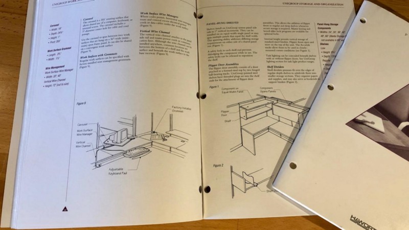
- My first job was with an agency called (appropriately) Technical Marketing, Inc., as a technical writer. I primarily wrote assembly instructions and user guides for office furniture.
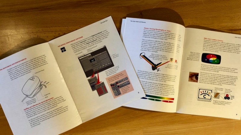
My second job started out as a technical writer tole that expanded to also include graphic design, illustration, and U.I. design for a manufacturer of color quality control instruments and software called X-Rite. I wrote and designed guides to help their users understand the basics of color science (and how to use their products), helped design their software interfaces, and wrote software Help systems in HTML.
The next role in my career was marketing manger for a small software company, CCMS Inc., where I wore all of the above hats: Writer and designer of their technical and marketing communications; their print materials and their software Help systems.
Then … this software company needed a web site.
More building blocks
I loved working with all of these skills, especially when I was able to “multi-task:” When I was able to write, design and illustrate a manual for X-Rite, or write and program a Help system for CCMS. And the common thread through all of these projects was that I got to explain how things work with words and pictures, and organize all of this information with hierarchy and taxonomy, with typography and hyperlinks.
I quickly moved from learning how to build my employer’s web site to picking up freelance web site projects to deciding that I wanted to design as many web sites as possible. As I absorbed as much information as possible about how to create great web sites, I soon found my brethren in the vanguard of this burgeoning new industry: The information architects, the usability experts and user interface designers — professionals who blended technical savvy with written and visual creativity into “information expertise.”
The Information Architects
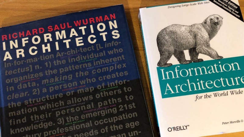
Richard Saul Wurman’s iconic “Information Architects” book defined a new discipline that had already existed when it was published in 1996, but didn’t have a name. But with this seminal work, boy did “I.A.” have an identity now, serendipitously arriving at the dawn of the World Wide Web when it could branch into a whole new frontier. Wurman profiles designers of print and environmental information systems, as well as interactive designers and their work in the adjoining years of the CD-ROM and Internet eras, such as Clement Mok and Nathan Shedroff. But there is no question that Wurman — previously a “traditional” architect by trade — is the godfather of the discipline himself. (Wurman would go on to found the TED conferences that continue to thrive today.)
The Usability Experts
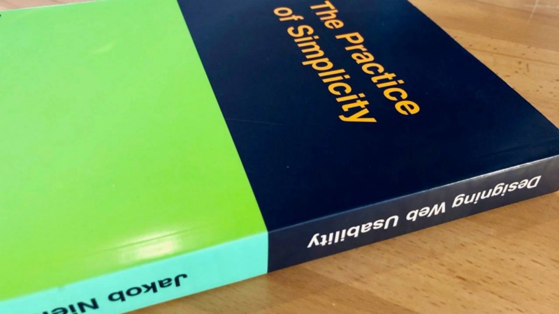
Then there were the usability experts like Jakob Nielsen, who may be credited with single-handedly maintaining the sanity of the early World Wide Web. That’s a bit hyperbolic, but Nielsen should be recognized as the authority in bringing the best practices of software user interface design to the Internet — and for reminding web designers and developers to value the practice of simplicity. While browsers and devices have changed over the past 20+ years, his 10 Usability Heuristics still hold a “ten commandments” level of relevance in the world of U.I. design.
The Information Designers
A related discipline within the sphere of the Information Architecture and Usability is information design and data visualization. Wurman folded some examples of this work into his profiles of designers and communicators who are practicing Information Architecture, but the more recognized authority on this specific practice is Edward Tufte. Tufte’s equally iconic books’ titles say it all: Envisioning Information, Visual Explanations, Beautiful Evidence.
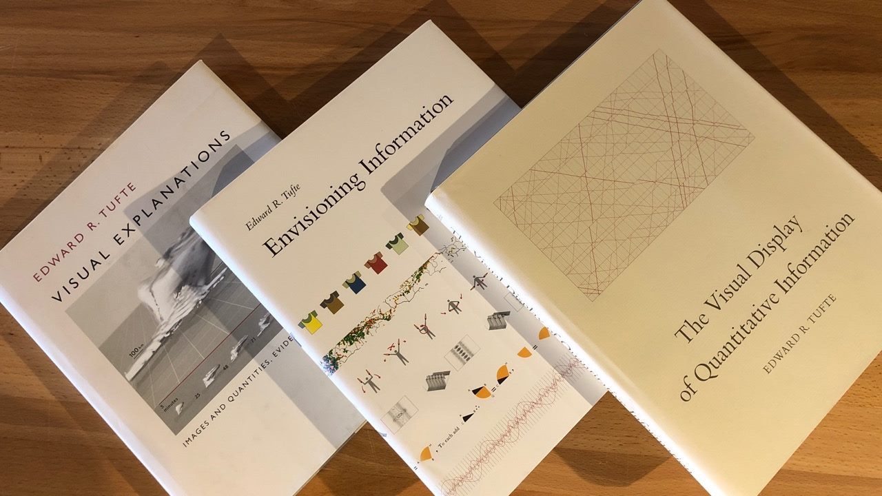
In these books, Tufte highlights what he considers to be extraordinary works of creating simple-to-understand visual representations of complex data and information. In his first book he identifies what he considers to be the “Citizen Kane” or “Sgt. Pepper’s” of genre: Charles Joseph Minard’s statistical graphic (created in 1861!) that tells the story of Napoleon’s march to Moscow by literally visualizing distance, direction, size and even temperature. (A poster of the Minard drawing has been proudly displayed on my office wall since before Elexicon was founded.)
When I studied these publications and their authors, I did not decide, “that’s what I want to do for a living.” The situation was rather the opposite: I already knew that being a visual communicator was what I wanted to do, and what I was becoming good at. Wurman’s “making the complex clear,” Nielsen’s “practice of simplicity,” Tufte’s “clear thinking made visual” — these men and their helped me identify the very best practices that I should follow when starting my interactive design agency.
(Quick story: When I sat down with my boss to tell him that I was resigning to start my own business, I explained my decision by showing him my Minard poster. I stated: “I want to start a business that does this,” assuming he’d understand that I wanted to create awesome visual design work that made complex data clear and easy to understand, and that I did not want to start a business to invade Russia.)
Leap taken. Agency named. Elexicon is born…
Everything comes together

Let’s fast-forward 15 years, and return to our work on the “Start With Why” explorations. We reflected on my personal professional history, and then focused on the agency’s work and found rather obviously that the agency’s original D.N.A. remained strong. Our clients, team members and projects continued to add “strands” to that D.N.A.: I would hire like minds, we would create an excellent infographic or build an elegant information architecture, and those deliverables and capabilities would lead to similar projects. Looking back at our body of work, we seemingly had remained on the path we started down. But what was that path exactly? How would I describe it? If it was indeed the same path, if we remained true to our D.N.A. for that decade and a half … that could define our “Why.”
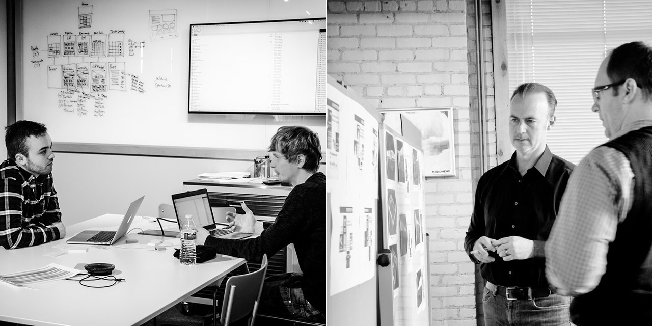
Building our Golden Circle off Sinek’s examples, we (like probably everyone) started with the “Apple Why” that has prominence in the YouTube video:
Why: “Everything we do, we believe in challenging the status quo. We believe in thinking differently.”
How: “The way we challenge the status quo is by making our products beautifully designed, simple to use, and user friendly.”
What: “We also happen to make great computers. Wanna buy one?”
To Elexicon, “we believe in making the complex clear by practicing the art and science of simplicity” was our “we believe in challenging the status quo.” Inject that with our copy writing style that follows that very mantra and: We Make Things Clear.
Why: Everything we do, we strive to Make Things Clear. To clarify the complex by practicing the art and science of simplicity.
How: We do this by prioritizing visual strategic planning, information architecture, and human usability into all the work we do: Planning, writing, creating, designing, developing and marketing.
What: We create usable structures, clear content, simple designs and beautiful code for web sites and apps; user-friendly interfaces for software; and engaging experiences for marketing and technical communications, including as infographics, data visualizations, and explainer videos. And we simplify our process through thoughtful planning, project management, measurement, and analytics.
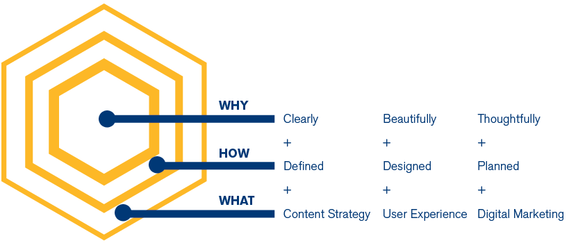
In the spirit of the Elexicon brand, we had some fun with our own “golden hexagon” below. All our engagements and projects have a Why, a How and a What, but we always start with “clearly, beautifully, thoughtfully…” Whatever work and deliverables come after that are driven by the goal of making things clear.
“Why” is product- and service-agnostic
Notice how interchangeable the “How” and the “What” are! We can swap out services and deliverables under the “Why” terms of Clearly and Beautifully and Thoughtfully, and the bullet points still work! As Sinek notes in the book and video, consumers will buy the next “thing” that Apple brings to market, not because of what it is, but because of Apple’s compelling and now-entrenched “Why.” His example there was, who would buy an MP3 player from Dell? Apple wasn’t just a computer company, but they were able to become a music and phone device company (among many other non-“computer” products) without anyone batting an eye.
Over the past 20 years, our core services and deliverables have remained similar, but they’ve gradually evolved as technologies have changed rapidly year after year. By always putting our “Why” front and center, we’ve been able to weather all those changes. We’ve never hung our hat on a specific type of creative deliverable, or specific development platform. Instead, we start with Making Things Clear and let that guide us toward the client’s goals, and the right strategies, tactics, deliverables and platforms. And Make Thing Clear has created a more natural and cohesive foundation for our agency culture.
What about you?
What passionate pursuit did you build your business around? What purpose have you instilled in your team that makes them jump out of bed in the morning and race into work? Some of you may know it for sure, and have your own “Why” statement. Others may just need to think about it a little more. In any case, Elexicon is an agency that can help you bring your “Why” (and your How and your What) to life through creative and digital communications.
You’ve heard the old adage, “To a hammer, everything looks like a nail.” That’s the “How” (the hammer) and “What” (the nail) taking the lead. Starting with your “Why” opens up the toolbox to more possibilities. Clients and teams don’t want to work with a “hammer and nail” company. Customers, employees and consumers are looking for a little sense of what you believe in, and maybe they can believe in it too.
If our particular brand of agency focus above fits with how you would like to differentiate and promote your products and services, connect with us.