A case for design systems
Posted by: Calvin ChoppHow design systems enable a tighter focus on what matters
I’d recently stumbled onto a thread on Twitter where one of the tweeters twittered (ok, I’ll stop) that current-day digital designers are no more than glorified digital “scrap bookers”— taking pieces and parts from things already created to slap something together and call it their own. The original arguer was making his case that modern-day digital products (and in turn producers) have become lazy and complacent, and are stifling design innovation. I understand the frustration this individual was feeling, though my experience may be different. I just think the complaint misses a larger point.
Let’s look at the ‘glorified scrap booker’ argument, this idea that most sites or digital products now produced are a smattering of already-set frameworks, APIs, code snippets, and repos that should work together to create something, as opposed to something uniquely created from scratch for a single purpose. I admit that there’s some truth to this. For instance, our agency leverages Boostrap‘s core for many of our projects (among other tools). This in turn gives us access to many UI components and built-in experience mechanisms and default styling that can be adjusted to fit the specific project need. It also allows us to quickly prototype and help make first-pass iterations on projects in a timely, and more affordable fashion.
There are dozens of common frameworks similar to Bootstrap that serve a similar purpose, such as Materialize CSS, Semantic UI, Material UI, UIkit and Foundation. Take your pick. Most offer similar functionality and serve similar purposes. Like any tool, they’re only as effective as the particular implementation.
Our goal with using such tools isn’t to diminish product value by using preset functionality. It’s to reduce effort on the mundane task of building things that can be shared or re-used, and focusing attention instead on the client’s/user’s specific issue or project goals to create something that suits the need.
It may be helpful to think of houses and what makes a house a home.
At a macro-level, when you look at a neighborhood of houses, everything seems the same. Think about when taking off on an airplane, and you look down and see all the rooftops. There’s some amount of truth to this. The majority of houses all have a basic, similar framework. You have a roof, windows that (normally) open and close, a door at the front, and at least four walls holding it all up, with separate rooms within that each serve a purpose. We all use or benefit from the ‘standard’ house and all its out-of-the-box ‘functionality’ and uses. Door frames all share a set of sizes that they might come in. You can expect ceiling heights to fall into a certain range. You could remove the ceiling fan from one house and reinstall it in the next with little or no question of how to make that adjustment. This similarity and sharing of general features and parts is intentional to allow for more efficient, affordable building and maintenance, while still giving the owner choice to make this house their home.
While a basic house framework is shared by all, there’s still the opportunity within these constraints to use those components to make something specifically tailored to the “user”. Looking at a more detailed view of a house, we see that people make it their own, either on their own (thanks Chip and Joanna) or with the aid of an architect/interior designer/contractor. We paint and remodel. Decorate and stage. Some hire builders to come in and take these general concepts of the house structure, and custom tailor that into home exactly to the owner’s requirements.
A great example of someone who took the foundation of a structure and then tailored it to the individual is Franklin Lloyd Wright.

Wright was famous for taking every detail into account for his clients when it came to making his houses into homes, down to the smallest detail. He was known to take into consideration the height of his client when determining the height of things like the windows, counters and even the furniture that he’d have made, so that line of sight, working heights and how a person lived in the home was completely tailored to that person. He worked with his clients to sort out exactly what was needed to make the project successful. Wright’s empathic and independent perspective played such a crucial role in the success of his designs, and is why he’s considered one of most prominent architects of a generation. Wright considered the “end user”, used general, shared frameworks and concepts, and then applied his ability to communicate design decisions tailored to his customer, which ultimately led to his success and timeless designs. Wright’s ability to harness the frameworks that he worked within while understanding his customer helped pave the way for not only his personal success, but also allowed him to innovate and drive architectural design forward.
Charles and Ray Eames, as described by Eames Demetrios in the book The Eames Primer describes our roles as designers well:
“… the role of the architect, or the designer, is that of a very good, thoughtful host, whose energy goes into trying to anticipate the needs of his guests…We decided that this was an essential ingredient in the design of a building or a useful object.”
Our roles as designers and our relationship with our clients is one that we’re to use our tools and skills in such a way that when we take into account our end products, we’re doing so with an anticipation the end-user, how our products functionality effects its intended use, how scalability and maintainability of the project plays into all of it.
Freeing Ourselves to Focus on Expected Usability
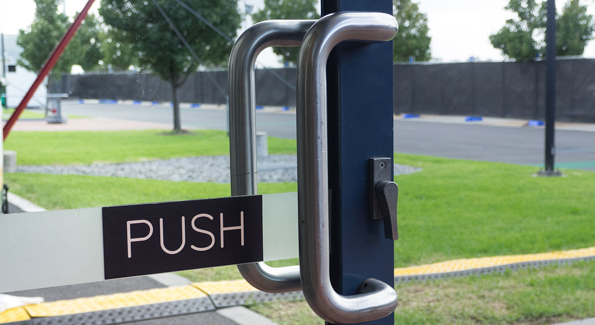
Another benefit to leveraging tools and frameworks is that it allows us to then focus on other important, user-focused ideas like expected usability. Certain things that we do have an expectation of what the outcome should be once it’s completed. If we turn a door knob, we expect a door to open. A water knob that’s labeled with a blue sticker should pour out cold water.
Like a home, digital products have these same considerations that we need to account for. A user understands what a content tab is, and there’s an expectation behind what will happen when a tab is clicked. Buttons are expected to do a certain thing when clicked. We’re even seeing a meshing of experiences between applications and other SaaS products with websites and other traditional digital platforms as users become more ingrained with navigating a digital world. Users are becoming more proficient, but this shift also means that we have larger audiences to account for, and the need for focusing on consistency in user experience and usability in our products is going to only increase.
A Case For Design Systems
Over the past number of years, I’ve noticed a rise in discussion around design systems, and see more and more companies integrating these into their DNA. Google’s Material Design is a good example. Apple has its Human Interface Design standards. Even the U.S. Government has their own design system.
In its simplest definition, a design system is a collection of design rules, constraints and principles that are implemented and managed by design and code.
What a design system is not is just a style guide (though a style guide may be used as part of a design system). It’s also not a pattern library, and not just a front-end framework.
What is a Design System?
In a very basic sense, a design system is the classification of components, along with the process that is built and maintained by the company to help develop a superior user experience, and to strengthen the companiy’s overall brand perception.
A design system takes into account those expected usability considerations in the form of components, cohesive design, as well as tone and voice with how content is presented. When they’re executed well, it helps to eliminate users ‘pulling when they should push’, which in turn increases their overall experience with your product, while also helping to minimize design and development debt. When we integrate tools like were described earlier as well, we’re able to further reduce that design and development debt.
But, I Can’t Afford to Allocate Resources to This…
Although I hope you can see how a design system being implemented is important and that there’s value in proactively looking at how and why you’re designing and developing your digital product, I get it… putting together a thought-out, documented design system takes time, resources and money.
Before you completely shrug off the idea that you could afford having a design system be a part of your project, think about the cost of not at least taking these thoughts into consideration.
Design Systems Reduce Design and Development Debt
When we’re putting together a digital product, one of the questions that’s important to address is the idea of scalability. What are the short- and long-term projections for the product that should be accounted for? Having a design system in place helps to address this concept of design and development debt. As your product grows, more features are added to the original base design, and in turn, other features and design aspects become outdated and need to be replaced. Teams on the client-side contract and expand. Product/project focus may shift. Without some form of a design system in place, the original product can loose its originally intended identity, and might start looking like that scrapbook. It also can quickly become a maintenance nightmare, and you may find yourself in a place where even the simplest of front-end updates end up taking exponentially longer than you’d expect.
With a design system in place, as changes occur, be it to the product or the teams that manage the product, there’s always a baseline to return to for reference on what should be managed, changed and built upon.
We’re Already Getting You Started with Design Systems, Though You Might Not Know It 😉
That might be a surprise, but it’s true! When you work with us on creating a digital product, we’re getting you started on the right track with some form of a design system. As I mentioned before, by using Bootstrap we’re able to leverage UI libraries and components that we can custom-tailor to the product and implementation, and do so in a way that future-proofs the design for scalability, design updates, and enhancements. Our teams of designers and developers work together to write code that is maintainable and semantic, and we’re using tools like Sketch and Zeplin that work together to create style guides, component libraries, and design hierarchies.
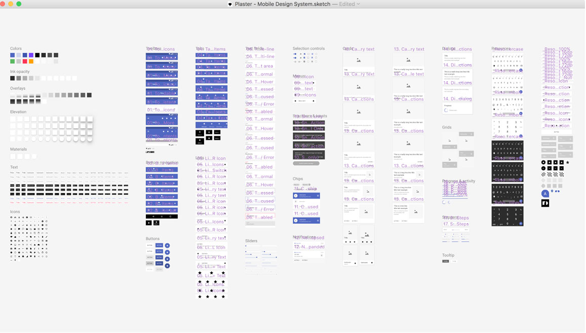
While the examples I’ve cited above don’t replace a fully built-out, documented design system, we integrate design-system thinking into our design and development process to allow these concepts to take effect, regardless the project size. It’s a great first-step for our customers to have a design-system approach that helps to minimize that design and development debt that can accumulate over time, and as well it makes use more efficient and proficient designers and developers. It’s really a win-win for us and our clients.
I believe as we venture into this new year, we’re going to continue hearing more about design-system methodology, and my hope is that you see how these processes and concepts are beneficial, and find ways to implement some of these concepts for yourself on your products and projects. As always, if you need a hand getting started, our door is always open.
Meet: Joe Greve
Posted by: ElexiconMeet: Joe Greve

Welcome Joe Greve, our new web developer at Elexicon! We are thrilled to have him join our team. To help you get to know Joe better, we asked him to answer a few questions.
What is your educational background?
I have an associates degree in Web Design from Kalamazoo Valley Community College, and spent a year at Ferris State University studying Game Design and Animation.
What are five interesting facts about you?
- No matter the topic, I probably have some random fun fact about it
- I like to think I’m pretty great at making food
- I’m exceptionally detail oriented (sometimes to a fault!)
- I can repair most anything on a car
- I once solved a Rubik’s Cube, by following a guide
If you could visit anywhere in the world you’ve never been, where would you go?
Japan! Osaka, Tokyo, Toyota City, the mountains — all of it.
How do you wind down after work?
Usually by cooking myself a nice meal. I find cooking really therapeutic. Maybe just because you can’t really rush a good meal!
What’s a topic you wish you knew more about?
I feel like my answer to this changes every week. But right now, I think I’d say automotive metalworking.
If you had to listen to one song for the rest of your life, what would it be?
Africa, by Toto. Extra points for the Weezer cover.
Who inspires you?
In no particular order: Steve Jobs, Christian von Koenigsegg, anyone who can stick it out with a personal project for more than a few weeks, and my fiancé.
The future is… Purple Cows
Posted by: Emma Sluiter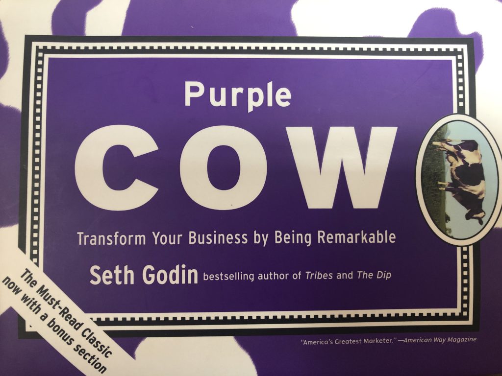
My Rating: 4/5 stars
Marketing guru Seth Godin’s Purple Cow is written for marketing professionals, and anyone who wants to expand their horizons with a unique perspective. He explores marketing strategies and uses case studies to help explain his point of view.
Godin begins by explaining that marketing doesn’t have enough “P’s,” referring to the famous “Four P’s of Marketing”:
- price,
- product,
- place,
- and promotion.
Godin suggests that we need to account for more “P’s,” such as positioning, publicity, pass-along, permission, and Purple Cows.
What are Purple Cows?
Purple Cows are standout experiences (like literally seeing a “Purple Cow”) that create more than just the typical desired outcome such as a purchase, a reaction, a click, etc. Purple Cows are a promotion technique that works best when the goal is to spread more than just awareness. The goal of a Purple Cow is to generate something deeper and more lasting: loyalty, a relationship, a creative spark, even an obsession.
Purple Cows are important in your business because people are too busy and will ignore your messages if you don’t break through the noise with something exceptional.
I know firsthand that consumers are frustrated with the clutter of advertisements and traditional marketing, so much that their disdain for ads has led them to ad blockers.
So, what should marketers do? Create Purple Cow experiences for consumers with otaku.
Otaku
Otaku is a Japanese term for people with obsessive interests. According to Godin, otaku describes something that’s more than a hobby, but a little less than an obsession.
Godin says, “Otaku is the overwhelming desire that gets someone to drive across town to try a new ramen-noodle shop that got a great review.”
As a marketer, I believe that otaku is an essential quality we are looking for in consumers. The more consumers have otaku towards your product, the more chances a Purple Cow phenomenon will occur.
A prime example of otaku in the United States is hot sauce. Boatloads of people are lining up to taste the hottest hot sauce and will compete in the most outrageous challenges. This obsession has led to a real business, therefore showing the impact of otaku.
Moving forward, we as marketers need to understand otaku-driven consumers to implement more successful products.
Final Thoughts
Purple Cow is a great book to gain inspiration for marketing professionals. Godin provides case studies that provide ideas on how to create remarkable experiences for our consumers.
My favorite case study was “How Dutch Boy Stirred Up the Paint Business.” Dutch Boy, a paint manufacturing company, created an entirely new product based on a key insight: people hated paint cans because they were heavy, hard to carry, hard to close, hard to pour from, and no fun. So, the marketing team changed the product, creating an easier to carry, easier to pour from, easier to close paint jug.
We need to take a design thinking approach towards marketing, and understand that sometimes you need to stop selling the product and think instead about how the consumers are engaging with it. If you exercise a little empathy, you can gain consumer insights that will increase purchasing decisions and sales.
That leads me to end with a question. How can you redefine what you sell and make it better?
“SiriCar, Drive Faster. We’re Running Late…”
Posted by: Brion Eriksen…and other dilemmas on the Autonomous-Vehicle horizon. Let’s explore the next three phases of our driverless future.
The arrival of self-driving, driverless, and (or is it “and/or”?) autonomous vehicles is beginning to form a fuzzy shape on the horizon. Press releases and tech pundits alike are setting their sights on 2020. Or the 2020’s. Or 2025 … or by the end of that decade. To be certain, the technology is developing at a rapid pace, looking and sounding truly amazing. But there is also a great deal of uncertainty surrounding exactly how and to what extent all of these paradigm-shifting advancements will change our lives. There are layers upon layers of controversies and questions, and the top layers all involve ethical dilemmas before you even get down deeper into the vast challenges around logistics, infrastructure, and automation.
The number one F.A.Q.
The University of Michigan’s Mobility Transformation Center is a test facility (a simulated village called “M City”) and proving ground for connected and automated vehicle technology. Their web site http://www.mtc.umich.edu has a helpful F.A.Q. page, where one of the questions and its answer really stands out to me (emphasis mine):
Q: What are the barriers to progress?
A host of advances in such areas as connected and automated vehicle systems, multi-modal transportation, traffic performance management, fractional vehicle use, as well as in new fuels, novel engine design, alternative energy sources, and advanced materials, offer great promise to address the challenges and, in the process, to truly revolutionize mobility in societies worldwide. Individually, none of these advances will have the impact needed; we must look at our mobility system as a whole. To date, there has been little work on how to integrate the technical, economic, social, and policy considerations to create a viable mobility “system” that meets the dynamic needs of a changing society.
While the technology is compelling, this new “mobility package” needs to be highly attractive to users throughout society and needs to be commercially successful, creating many new business partnerships and opportunities.
Here’s a quick YouTube glimpse at what’s going on at M City.
Tech giants like Tesla, Google, Uber and Apple have all been connected to driverless car projects, as well as the major traditional car manufacturers. Each claims to have a plan, a strategy, and a time horizon. There have been many separate discussions, articles and essays by futurists and pundits about different technologies and moral dilemmas. States like California are beginning to prepare legislation to pave the way for … wait a minute. For what? As the U of M F.A.Q. articulates, very little of all of this technology has begun to collectively form a road map toward any sort of unified architecture. I’m a Stephen Covey “begin with the end in mind” guy and I believe the time has come to begin thinking about the need for total integration, for the “system,” the “mobility package.” And, as part of that planning, the industry also needs to find the best platforms for clearly communicating the path forward to the commuter and traveler marketplace so that they begin to buy into the excitement and opportunity. Right now, the future market of buyers who would need to hand over the keys and total control of their minivans, SUVs and sports cars view the driverless future with a lot of trepidation and confusion, and a little bit of fear.
Here are a couple articles, in case you need a further primer on the potential technologies and moral dilemmas. Then, let’s keep going by breaking down that F.A.Q. with a few more of my own.
Phase 1: Keep your eyes on the road and your hands on (or off) the wheel
What if we simply roll with the current trend of making today’s cars smarter and safer?
New car models are already equipped with amazing technology that is being derived from autonomous vehicle research and development. In fact, these are practically the only features car companies are advertising today: Parallel parking assist, back-up cameras, lane change sensors, automatic braking. These advancements are focused on safety but will continue to help manage fuel economy as well.
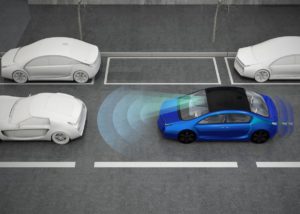
Because these “smart” technologies are becoming so pervasive, more and more of these types of cars are taking over the roadways. Within the next decade, a very high percentage of all cars on the road will be assisting drivers avoid their own common mistakes and defend against others. In the early 2020’s we may find that highway fatalities and injuries have decrease significantly, and are trending down rapidly.
Then what? Does the industry continue to aggressively pursue taking the human driver completely out of the equation to even further bolster safety and efficiency? Or do manufacturers and developers invest in other aspects of the vehicle technology such as electric/battery power and more charging stations? Consumers may find themselves comfortable living in this world, where they are still in control of their commute, can drive a sports car or SUV, and not be forced into riding in a Rolling iPhone or Android-On-Wheels. These enhanced-yet-still-human-controlled products would also help make the ride-sharing market safer and more efficient as well. Overall, this path keeps paid drivers — from long-haul to UPS to Uber — employed, as well.
Phase 2: We all need to share the road
More automation gradually but unrelentingly works its way onto the road.
Let’s assume the above scenario continues to come to fruition into the early 2020’s, but the big manufacturers have their driverless cars and related “connected infrastructure” technologies ready to do as well: They’re tested, municipalities think they’re prepared, some early-adopters hit the road without a steering wheel. What does that world look like?
This phase (let’s guess it at 2025–2035) will present an interesting rubicon: If consumers aren’t totally bought into the many paradigm shifts and involuntary life hacks that occur, or if the level of traffic safety and/or energy efficiency does not reach predicted targets … what then? Driverless adoption will continue to advance but it may slow, and impact the overall health of an industry that has probably invested billions multiple times over. Does advancement eventually “hold” and driverless vehicles find their nichés in certain ride-sharing, delivery and transit services, while the consumer marketplace dictates that they want to literally keep their hands on the wheel?
Of course, the opposite could happen as well. In 2030 driverless adoption could be moving full speed ahead, with consumers climbing in their back seat living rooms and offices and enjoying their productive commutes. One of the best sales pitches I’ve heard describes your driverless car dropping you off at work and going to park in a massive industrial ramp nearby but out of eyeshot of otherwise luscious, parking-structureless environs. When you’re ready to leave work, you summon your GoogleCar to first go pick up your children from band practice before coming to fetch you. Everyone shares the thoroughfare in their roving family rooms, waving to each other and to the poor suckers still forced to keep their eyes on the road in their merely driver-assisted vehicle.
Phase 3: We live inside a computer
Like a circuit board on silicon, our highways transport us around like bits and bytes to our destinations.

I feel like I’m skipping WAY ahead here, but the logical sequence of this technology is to first assist drivers, then augment drivers and driving, and then eventually replace it all, and replace it completely. Otherwise, we might as well remain in Phase 1 … Phase 2 could offer a world full of uncomfortable juxtapositions and moral dilemmas, with human drivers getting fed up with confused, cautious Roomba-mobiles. But if we can get to Phase 3, this is where everything speeds up like never before. If there are no human-controlled cars on the road and all robotic, connected vehicles are communicating with each other in a grand symphony orchestra of traffic flow, then the possibilities and benefits are pretty remarkable: More safety, more time savings, less fuel usage, less parking real estate. Lanes can be narrower, we may not need garages, or even our own cars or car insurance. That expense can be put to other uses in our lives. Utopia and Nirvana rolled into one.

But … Many jobs will be replaced. Will this Utopian Nirvana be only for elites, while the less fortunate actually become less mobile than they are now? Also, we’d be at the mercy of a giant, potentially hackable, SkyNet-like “system” as the M City web site alluded to.
And how do we get “there” from “here”?
Does the U.S. Government set a “Zero Day” in 2030 or 2040 when all traditional or assisted cars must be off the road, and driverless vehicles take to all the new infrastructure in one simultaneous, world-changing swoop? And speaking of “world-changing:” Is this a global event? Will the “haves and have nots” who can afford and participate in this revolution also apply to rich vs. poor nations?
Something this far-reaching and earth-shifting is going to need to be communicated. Clearly, in simple terms, without bias and with a focus on the common good of everyone.
It’s a huge leap, that’s for sure. One that skeptical consumers may not be ready for any time soon, especially in today’s political climate. Now may not be a good era to espouse a technology revolution that is perceived as being based in elitist Silicon Valley and replacing yet more jobs with automation. Something this far-reaching and earth-shifting is going to need to be communicated. Clearly, in simple terms, without bias and with a focus on the common good of everyone. And that, again, is unfortunately not something that we’re seeing or hearing a lot of in today’s political climate.
Back from the future
In the present day, it’s now time to communicate the vision (begin with the end in mind)
With the “Big Three” tech companies Apple (probably), Google and Elon Musk’s Tesla firmly behind autonomous vehicles, alongside Detroit’s traditional Big Three, a driverless future is happening … someday. Their research and development has brought the technology to the brink of being ready to break through, and now is the time to begin communicating their progress and clarifying both the barriers and the benefits. A vision needs to begin taking shape, including an articulation of the “phases” that I outline above. These communications need to address not only the “wow” factor but also the societal and safety concerns. They’ll need to prove that the benefits far out-weight concerns, and that millions of professional drivers will not lose their livelihood. Demonstrating a predicted surge in jobs needed for manufacturing and infrastructure related to driverless technology rollout would, of course, but useful as well.
So far, communicating this vision has been fragmented among the aforementioned companies and institutions. Tech blogs and futurist essays are making best-guesses as to what the next decades will bring. Online resources like this Germany-based http://www.driverless-future.com/ are a good aggregation of what’s happening, everything that’s been done and said, but it’s more industry-focused than geared toward getting consumers excited.
I’m raising my hand in the air as someone who’s interested in helping with this communication effort, even if at first it’s continuing to participate in the conversation.
Making Photoshop Work Better for You
Posted by: Calvin Chopp
I’ve been a heavy Photoshop user for over 15 years, using it for anything from general graphic design and photo editing to web layouts and UI to digital illustrations and concept art for video games. To say the least, it’s versatile and has been around seemingly forever, at least in my lifetime.
Using Photoshop as long as I have means I’ve gotten used to how things work, and when those things change, sometimes it feels disruptive. I’m going to discuss two of these recently updated features here, and tell you how you can revert them back to how it originally worked if you so choose.
FEATURE 1: New Document Workspace
Let me start off by saying that if you’re new to Photoshop, I can see how this particular update that was recently made in CC 2017 might be useful to you. There’s a huge variety of templates to choose from now—anything from photo templates, to mobile, film and more. It also gives you the option to use a recent size item you’d created. But, for a more seasoned Photoshop user, using the software for a particular purpose, it’s a bit much. Here’s why it was for me:
- Additional load time. Granted, it’s not significant, and likely varies from machine to machine (I’m running a Mid-2014 Macbook Pro, w/ a Solid State hard drive, 16GB of RAM and an i7 Processor), but the time it takes from launching Photoshop to getting to the New Document Workspace adds nearly 2 seconds of wait time for me. That may not sound like much, but as someone who spends a huge portion of their work day in the software opening, closing, and creating many Photoshop documents each day, it is noticeable, and gets annoying.
- Too many upfront features. So many options! Too many, I feel upfront, at least for me, which I think adds to that additional upfront loading time. Packing in so many features makes it a little confusing with the way the new document inputs are laid out. If you’re tabbing through each input field (i.e. width, height, resolution, etc), in the legacy New Document workspace, you went from top to bottom, like a standard input form. In the new input form, you jump from top, down, to the right, then left to right, and down again. It seems unnecessarily confusing.
Thankfully, PS CC 2017 allows you to set your New Document workspace back to the legacy version if you’d prefer—here’s how:
Reverting Photoshop’s New Document Workspace:
First, you need to get to Photoshop Preferences. On a PC, go up to the Edit menu in the Menu Bar along the top of the screen. Choose Preferences, and then choose General. On a Mac, go to the Photoshop CC menu, choose Preferences, then choose General. This can also be reached by hitting the shortcut Command + K.
This opens the General Preferences dialog box. Within this, look for the option that says “Use Legacy “New Document” Interface, and click this option.
You’ll need to quit and relaunch Photoshop for the change to take effect.
FEATURE 2: Last Filter Shortcut
Doing web design, and UI layout and design often means repeating a similar style or filter to multiple elements. In the past, on a Mac, this was easily done by applying the most recent filter to multiple layers quickly by hitting Command + F. But in the latest iteration of CC 2017, they’ve replaced this long-standing keyboard shortcut from Command + F, to Control + Command + F, and giving the existing Command + F keyboard shortcut command to a new feature, the extended Photoshop Search functionality.
Like the New Document screen, it’s ultimately not a big deal, but I’d argue that it’s not good user experience to introduce a new feature, and replace an existing keyboard shortcut that users are accustomed to.
If you too find this annoying, you can reset your keyboard shortcut command to repeat a filter like it had before:
- Open Photoshop and navigate to your Keyboard Shortcuts. You can do so by doing one of the following:
One you have arrived at Keyboard Shortcuts,
- Click on the Filter option from the list of available current keyboard shortcuts, and select Last Filter
- Click into the shortcut area that currently reads Control + Command + F, and add your desired keyboard shortcut. NOTE: you add the new desired shortcut by actually performing the shortcut, in this case, hitting the keys Command + F, as opposed to spelling it out within the input field.
- You’ll get a warning noting that by adding this keyboard command you’ll be overriding the Edit > Search functionality, which is what we wanted to do along along.
- Click OK
Overall, I’ve been pretty happy with the most updates that I’ve experienced in Photoshop over the years, with the exception of some rather minor annoyances such as these. Hopefully these tricks benefit other Photoshop users experiencing similar frustrations.
